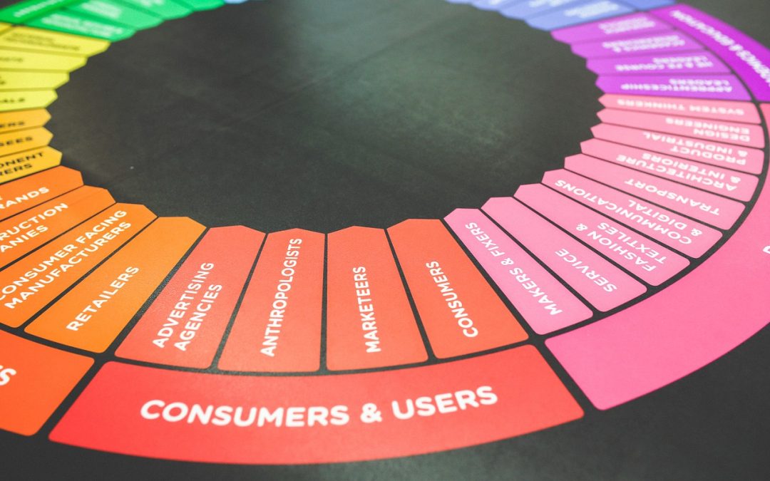
When you start surfing the Internet and sifting through websites, one of the first things that probably catches your attention are all of those colorful images. You probably notice things like videos, photos, animations and other forms of visual content long before you notice the content itself. Well, what if we were to tell you that this is all done by calculated design?
That’s right. All of this visual content is meticulously created specifically with the viewer or passerby in mind. All of those charts, infographics, GIFs and other shareable images are put on your screen in order to make you stop, click, and engage. Now, what if we told you that the specifics of this content creation even came down to the colors themselves?
When it comes to brand marketing and design, an understanding of color theory is essential. It has what is arguably the strongest influence over your audience and how your message will be received. You see, designers and their brands depend on those eye-popping images to catch your attention just long enough for you to look at the content that they are selling. They use certain colors in such a way to evoke feelings like empathy (common among nonprofits), passion (seen often where vanity is a factor – cosmetics, automotive, and entertainment), tranquility (perfect for home goods and pharmaceutical companies), or any number of other states of mind. That’s why color theory should be your first consideration in the development and creation of compelling visual content for your brand. If it is not carefully orchestrated, it can make or break the way the public views your brand.
What is Color Theory?
It may seem simple enough, but picking the right colors can really make all of the difference when it comes to brand dissemination, recognition and retention. There are a great many factors to consider. Though color isn’t usually a part of the early stages of logo and brand design, it certainly plays an integral role in bringing the whole concept together.
Color is the first thing that your brain will recognize and respond to. It invokes emotional responses, feelings and vibes. And, when you factor that into branding and design, it is that carefully orchestrated vibe that actually represents your brand and message.
Color theory, itself, is the science and art of color. It is an idea that encompasses a multitude of concepts, definitions and design applications. This idea essentially explains how people perceive color, as well as how colors work (or don’t work) together, and how they portray subliminal messages in order to communicate an overall message. Color theory is a tool of practical guidance for color mixing and the resulting visual effects of a specific color combination based on the color wheel.
What is Color Harmony?
Color matters to your brand because it brings harmony in the form of visual interest and order. Audiences most respond to designs which are in fact harmonious. They look for specific arrangements, patterns and colors that are pleasing to the eye. This opens doors for better engagement with audiences and creates overall balance in the visual experience.
On the other hand, when things clash, are visually too harsh or appear to be either boring or in chaotic disorder, harmony has not been achieved. This, again, is why color theory matters, as it brings overall messages and experiences together. You certainly don’t want your viewers’ visual experience to come off as bland. Then, they won’t engage, and your message will not be received. People naturally reject information that isn’t stimulating, is unorganized or presented in a format that we can not understand. When it comes to brand design, however, visual tasks require that you present your message in a logical structure, and that’s what color harmony delivers.
Why Should You Really Care?
When it comes down to it, color theory is that final element that will define your brand and message. In other words, branding and marketing, including overall sales are all dependent on this theory of harmonizing visual content. All it takes is a little basic knowledge about colors and color schemes, and you’ll be prepared to make more effective branding decisions. It’s all about the psychology behind color choices, so keep that in mind when you start designing for your audience.
Whether you’re interested in revamping your company’s current design or building an entirely new brand, our design experts have the knowledge and abilities that will make your business shine in today’s saturated marketplace. Contact us to learn more about our services or to request a quote today.


Recent Comments